
.svg)

Strategic Google Slides Themes for Impactful Brand Presentations

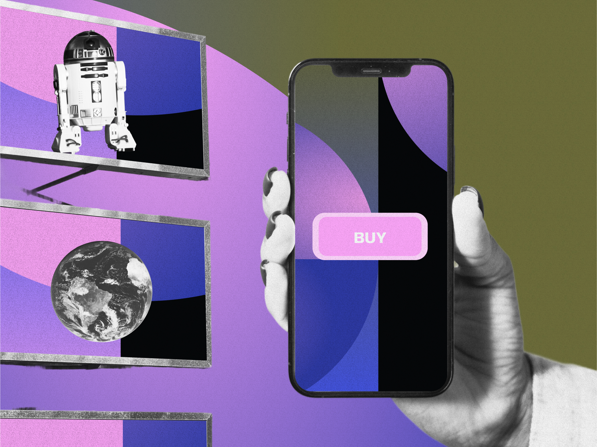
Great presentations aren't just eye candy; they're strategic powerhouses. When you harness strategic Google Slides themes for impactful brand presentations, ordinary slides transform into magnetic brand experiences.
Every splash of color, thoughtful font choice, and carefully selected image becomes part of your brand's unforgettable story. The proper presentation design doesn't just communicate information; it builds recognition, establishes authority, and creates lasting impressions that keep your brand top of mind long after the last slide fades.
In this article, you’ll learn how to strategically use Google Slides themes to create brand-aligned presentations that not only look sharp but also build emotional connection, drive consistency, and maximize audience engagement.
Understanding Strategic Google Slides Themes
Think of Google Slides themes as your brand's digital wardrobe. Just like clothing choices communicate personality, your presentation design speaks volumes about your brand values.
Google Slides offers numerous advantages for brand-aligned presentations, thanks to its cloud-based collaboration, widespread device accessibility, and seamless integration with other Google Workspace tools.
The Digital Foundation of Your Brand Identity
Google Slides allows you to create custom templates that serve as the foundation for all brand-aligned presentations. This ensures visual consistency regardless of who makes them within your organization. You can customize nearly everything, colors, fonts, layouts, backgrounds, and transitions, to build presentations that authentically represent your brand from the first slide to the last.
Cloud Collaboration and Accessibility Benefits
The collaborative nature of Google Slides means multiple team members can work simultaneously on presentations, ensuring brand standards remain consistent across departments. By integrating technology-focused design services, you can further enhance collaboration and accessibility.
This accessibility becomes particularly valuable for organizations with remote teams or multiple offices, as everyone can access the same brand-aligned templates regardless of location or device.
Integration with Brand Ecosystem
Google Slides doesn't exist in isolation; it works harmoniously with your entire digital brand ecosystem. Its integration with other Google Workspace tools means your presentations can seamlessly incorporate data, documents, and assets from across your organization, creating a cohesive brand experience both internally and externally. This is much like cross-reality branding, which enhances brand identity across platforms.
Core Elements of an Impactful Brand Presentation Using Google Slides
A compelling brand presentation goes beyond aesthetics to create meaningful connections. These five core elements work together to ensure your presentations not only look good but also effectively communicate your brand's story and values.
Visual Branding Consistency
Consistency serves as the glue holding your brand presentation together. Apply your brand's color palette consistently using Google Slides' theme editor to create immediate recognition.
Staying aware of emerging color palettes can help keep your presentations up to date. Choose fonts that match your brand guidelines and create a clear content hierarchy, ensuring your branding and web design remain consistent and are easy to use. Embed your logo in master slides for clean, consistent placement throughout your presentation.
Strategic Image Selection
Images speak louder than words, especially in presentations. Select visuals that authentically represent your brand's personality and values, and use inclusive design resources to enhance authenticity. Maintain a consistent image style, treatment, and color grading across all slides. When stock photos are necessary, choose options that feel natural and aligned with your brand aesthetic, avoiding staged or generic images that undermine authenticity.
Purposeful Layout Design
The arrangement of elements on your slides directly affects how your audience processes information. Create consistent slide layouts and backgrounds for a polished, professional look. Establish clear visual hierarchies that guide viewers through the information in a logical way. Allow for adequate white space to prevent cognitive overload and create breathing room that lets your key messages shine.
Storytelling and Message Cohesion
Every excellent brand presentation tells a compelling story. Set up your presentation with a clear beginning that establishes the challenge or opportunity, explaining why your brand exists.
Create an engaging middle section that showcases your unique brand attributes and solutions. Finish with an impactful conclusion demonstrating how your brand creates real value. Throughout, maintain a consistent voice that strengthens your brand identity.
Emotional Connection Through Design
Design choices should evoke specific feelings aligned with your brand personality. Color psychology plays a significant role—warm tones create different emotional responses than cool ones.
Typography conveys subtle emotional cues through its structure and style. Visual metaphors and thoughtful imagery build deeper connections with audiences, creating emotional connections through design. These emotional elements work together to make your presentations memorable and impactful.
Selecting Strategic Google Slides Themes
Your theme choice speaks volumes about your brand before you present a single word. These four approaches help ensure your selections align perfectly with your brand identity.
Industry Context Consideration
Different industries have different visual expectations. Law firms and financial institutions typically benefit from minimalist, sophisticated designs that convey trustworthiness. Creative agencies and entertainment brands can adopt more vibrant, boundary-pushing visual treatments, utilizing marketing design strategies to make a lasting impression.
Educational organizations often succeed with clean, accessible designs that prioritize clarity. Match your theme selection to both your specific brand and broader industry expectations.
Brand Personality Alignment
Your presentation theme should reflect whether your brand is playful, authoritative, innovative, traditional, or some unique combination. Playful brands might incorporate more animation and vibrant colors. Authoritative brands often benefit from structured layouts with strategic use of white space. Innovative brands can experiment with unexpected layouts and visual treatments. Traditional brands typically shine with classic design elements and familiar structures.
Color Psychology Application
Colors evoke specific psychological and emotional responses. Blues convey trust and stability, making them popular for financial and technology presentations. Reds create energy and urgency, effective for calls to action. Greens suggest growth and environmental consciousness. Purples imply creativity and luxury. Select theme colors that strategically evoke the emotions most aligned with your brand messaging and goals.
Typography Strategy Development
Fonts communicate subtle but powerful messages about your brand. Serif fonts typically convey tradition, reliability, and sophistication. Sans-serif fonts project modernity, cleanliness, and approachability. Script fonts suggest creativity and elegance but sacrifice some readability.
Display fonts create distinctive impressions but should be used sparingly. Choose typography that balances brand personality with presentation readability. For best results, consider effectively combining Google Fonts to achieve this balance.
Designing for Engagement and Retention with Google Slides
Effective presentations demand both attention and remembrance. These five strategies create engaging experiences that stick with audiences long after the presentation ends.
Purposeful Minimalism
Clean, uncluttered slides communicate more effectively than busy ones. Use white space strategically to guide the eye and create breathing room around important content. Focus each slide on one main idea with concise supporting text. Create a clear visual hierarchy that emphasizes key messages. Simplify data visualization with clean charts styled to match your brand aesthetic. This minimalist approach prevents cognitive overload while highlighting what matters most.
Strategic Storytelling
Stories create connection and memory in ways that facts alone cannot. Structure your presentation as a narrative journey with a clear beginning, middle, and resolution. Use consistent characters or personas throughout to create continuity. Create emotional peaks and valleys that maintain engagement. Connect your brand story directly to audience needs and challenges. This narrative approach transforms information delivery into an immersive experience.
Visual Communication Techniques
Well-chosen visuals communicate complex ideas instantly. Use high-quality, brand-aligned images that extend rather than merely decorate your message. Create custom diagrams that simplify complex concepts. Develop metaphorical visuals that create emotional connections. Maintain consistent visual treatment across all imagery. These techniques reduce cognitive load while enhancing audience understanding and retention.
Interactive Engagement Elements
Transform passive viewers into active participants through thoughtful interactivity. Create hyperlinks for non-linear navigation that allow audiences to explore content based on their interests. Incorporate embedded videos and multimedia, such as motion graphics, for a more immersive experience.
Design clickable elements as interactive touchpoints that reveal additional information. Add strategic animations to focus attention and illustrate processes, keeping in mind the cost implications of motion design. These interactive elements transform your presentation from a monologue into a conversation.
Data Visualization Excellence
Numbers tell stories when properly visualized. Create branded chart styles that maintain visual consistency while clarifying data. Simplify complex information through thoughtful graph design.
Use progressive disclosure techniques for complex data sets. Incorporate visual comparisons that make statistics meaningful, utilizing advancements in data visualization techniques. These visualization techniques make data accessible and memorable while reinforcing your brand aesthetic.
Ways to Streamline the Google Slides Design Process
Creating brand-aligned presentations shouldn't require sacrificing quality for speed. These four approaches significantly reduce design time while maintaining high standards of excellence.
Template and Master Slide Implementation
Think of master slides as the foundation of your presentation. Set up brand colors, fonts, and layouts in the master view. Add your logo and recurring elements once rather than on every slide. Create multiple master layouts for different content needs. Save these masters as templates for future use. This upfront work saves countless hours on individual slide formatting while ensuring consistency.
Theme Builder Efficiency Techniques
The Theme Builder offers powerful time-saving capabilities. Define your exact brand palette once for use across all presentations. Set up brand fonts for headings and body text as default styles. Create custom layouts reflecting your brand style for various content types. Establish consistent background treatments. These theme settings become your presentation starting point, eliminating repetitive formatting tasks.
Image Handling Optimization
Strategic image management saves significant time. Create an organized library of brand-approved images for easy access. Implement proper compression techniques to maintain quality while reducing file size. Use image masking for custom shapes that align with your brand aesthetic. Establish consistent image placement and sizing standards. These practices streamline what is often the most time-consuming aspect of creating a presentation.
Workflow Automation Techniques
Modern tools offer numerous automation opportunities. Explore the Google Workspace Marketplace for useful add-ons that extend functionality. Use keyboard shortcuts for everyday formatting tasks. Create reusable content blocks for frequently used elements. Implement slide libraries for quick access to previously created content. These automation strategies let you focus on creative work rather than repetitive formatting.
Final Considerations for Memorable Google Slides Presentations
Even beautifully designed slides require thoughtful delivery and refinement. These three considerations ensure your presentations create a lasting impact.
Practice and Delivery Refinement
The most stunning visuals fall flat without confident delivery. Use Presenter View to see your notes while the audience sees only your presentation. Pra—practicesitions, especially with animations or interactive elements. Test your presentation on different devices and screens to prevent technical surprises. Know your content thoroughly to boost confidence. Your comfort with the material directly enhances the brand experience you create.
Feedback Collection and Implementation
Make audience feedback an integral part of your presentation strategy. Ask specific questions about visual impact, message clarity, and brand impression. Analyze engagement metrics for digital presentations to identify strong and weak sections. Conduct internal reviews with team members before external presentations. Track improvements over time to determine what works best for your brand and audience. This ongoing refinement demonstrates a commitment to excellence.
Continuous Brand Evolution
Presentations should evolve alongside your brand. Periodically audit your presentation templates against current brand guidelines. Update your visual approach as design trends and audience expectations evolve, staying informed about future marketing design trends.
Maintain a balance between consistency and freshness that keeps your brand relevant. Develop presentation standards that can flex to accommodate brand evolution. This forward-looking approach ensures your presentations remain powerful brand assets.
Elevating Your Brand with Strategic Google Slides Themes
Killer Google Slides are about bringing your brand to life in digital form. Every slide tells your story. When you employ strategic Google Slides themes for impactful brand presentations, your visuals consistently reflect who you are, and something magical happens.
Interactive elements transform static presentations into dynamic conversations. Innovative design approaches help you create stunning slides without the headache. Remember, each slide serves as your brand ambassador. With consistent visuals, engaging elements, and thoughtful design, you don't just share information, you forge genuine connections that last.
Ready to transform your presentations from forgettable to unforgettable? Use the steps provided to create Google Slides presentations that truly reflect your brand's unique personality and captivate your audience. At NoBoringDesign, we design brand experiences that go beyond grabbing attention; we build lasting emotional bonds that keep your customers engaged. Schedule a meeting with us to discover how!
Key Takeaways
- Strategic Google Slides themes serve as your brand's digital wardrobe, visually communicating your values and personality
- Consistent visual elements across slides significantly strengthen brand recognition and message retention.
- Customization beyond default options creates distinctive, professional presentations that stand out from competitors
- Interactive elements transform passive viewing into engaging brand experiences that drive deeper connections
FAQs
How to add audio to Google Slides
To add audio to Google Slides, first, open your presentation and select the slide where you want to add audio. Then, click on "Insert" in the menu and select "Audio." You can upload an audio file from your Google Drive. Once uploaded, you can resize and position the audio icon on the slide. You can adjust the audio settings to play automatically, loop, or play when clicked. This is a great way to enhance presentations with background music or voiceovers.
How to add music to Google Slides
Adding music to Google Slides is simple. Start by opening your presentation and selecting the slide to which you want to add music. Click on "Insert" from the top menu, then choose "Audio" from the options. You can upload an audio file directly from your Google Drive. Once inserted, you can adjust the audio icon's position, size, and settings to play automatically, on click, or loop. Adding music can make your presentation more engaging and memorable, creating a richer experience for your audience.
How to add a video to Google Slides
To add a video to your Google Slides presentation, open the slide where you want the video to appear. Click on "Insert" in the top menu, then select "Video." You can search for a YouTube video or upload one from your Google Drive. After the video is inserted, you can resize it and adjust its placement on the slide. You can also configure playback settings, such as autoplay or starting at a specific time. This feature is perfect for enhancing presentations with multimedia content.
How to embed a video in Google Slides
Embedding a video in Google Slides involves inserting a video directly from YouTube or Google Drive. To do so, open your presentation and select the slide where you want to place the video. From the top menu, click on "Insert" and select "Video." You can search for a YouTube video or upload one from your Google Drive. After the video is embedded, you can adjust its size and placement. You can also set it to autoplay when transitioning to the slide or play with a click.
In a digital universe where your thumb is one swipe away from the next distraction, some brands don’t just catch your eye, they make you pause, engage, and remember. These aren’t just companies posting content; they’re digital storytellers, culture-makers, and conversation-starters who turn fleeting attention into lasting loyalty.
What makes these social media standouts so magnetic? Spoiler: it’s not just deep pockets or massive marketing departments. It’s their uncanny ability to blend creativity, consistency, and connection into every post. With platform-specific savvy and unforgettable brand voices, they’ve cracked the code on digital relevance.
Ready to see who’s setting the standard? Let’s discover the top 15 brands turning social media into an art form and discover what makes their strategies so effective.
1. Nike: Inspirational Storytelling That Moves
Nike dominates social media through powerful storytelling that transcends product promotion. Their approach centers on emotional connections through inspirational narratives featuring both elite athletes and everyday heroes. This strategy transforms their brand from a sportswear company into a movement celebrating human potential.
The Power of "Just Do It"
The iconic "Just Do It" campaign continues to evolve across social platforms, delivering motivational content that resonates with audiences of all athletic abilities. Nike consistently features diverse athletes and real customer stories that inspire people to take action. Their content rarely focuses directly on products, instead highlighting the emotions and achievements sports can unlock.
Community Activation Through Challenges
Nike excels at creating participatory experiences that build community through shared goals. Their running and training apps connect directly to social platforms, allowing users to share accomplishments with branded hashtags. This creates an organic stream of user-generated content while fostering a sense of belonging among Nike enthusiasts.
By focusing on authentic engagement, Nike exemplifies how brands can authentically engage with audiences and build lasting relationships.
2. Starbucks: Creating a Cultural Phenomenon
Starbucks has transformed coffee drinking from a mundane activity into a cultural experience, mainly through its strategic social media presence. Their content strategy blends product highlights with behind-the-scenes glimpses that make followers feel like valued insiders.
Seasonal Campaigns That Create Buzz
Starbucks has mastered the art of seasonal promotion, particularly with its fall campaign centered around the Pumpkin Spice Latte. Their "Leaf Raker's Society" Facebook group has grown to over 38,700 members, a community bonding over shared enthusiasm for autumn offerings. This strategy transforms product launches into cultural moments that followers eagerly anticipate and share.
Barista Storytelling
The human element remains central to Starbucks' social strategy. Regular features showcasing baristas crafting drinks or explaining sourcing practices humanize the brand while educating consumers. This approach highlights their commitment to quality while creating emotional connections that transcend transactional relationships.
3. Wendy's: Revolutionizing Brand Voice
Wendy's transformed its social media presence, and the entire fast food category, through an unexpectedly sharp and witty voice that breaks corporate communication norms. Their strategy shows that authenticity and personality trump polish and formality in building engaged online communities, highlighting the importance of a consistent brand voice.
Real-Time Engagement and Competitor "Roasts"
Wendy's fearless approach to Twitter conversations, particularly their playful "roasting" of competitors, creates entertainment value that extends far beyond their product offerings. Their quick-witted responses to trending topics and customer interactions generate massive engagement while showcasing their distinctive brand personality.
Balancing Humor with Value
While humor defines their approach, Wendy's skillfully balances witty content with practical value through limited-time offers and menu updates. This ensures followers receive tangible benefits alongside entertainment, creating multiple reasons to engage with their channels.
4. GoPro: Turning Customers into Content Creators
GoPro brilliantly leverages user-generated content as the cornerstone of its social strategy. Rather than creating ads about what their products can do, they showcase what customers create with them, building an aspirational community around adventure and exploration, much like effective web design strategies focus on user engagement.
Hashtag Strategy That Builds Archives
Through branded hashtags like #GoPro, the company collects a constant stream of customer-created content that dramatically extends their reach while providing authentic proof of their products' capabilities. The best submissions often get featured on their official channels, incentivizing more creation and participation, and creating immersive branded experiences for users.
Visual Consistency Across Platforms
Despite featuring content from countless sources, GoPro maintains a recognizable visual style across platforms. Their signature fish-eye perspective, vibrant colors, and action-focused imagery create instant brand recognition, even without a logo. This visual consistency strengthens brand recall in a crowded digital landscape.
5. Airbnb: Selling Experiences, Not Properties
Airbnb uses social media to showcase transformative travel experiences rather than merely listing properties. Their strategy positions them as enablers of authentic adventure rather than simply accommodation providers.
Host and Guest Spotlights
By featuring real host and guest stories, Airbnb creates emotional narratives around the connections its platform facilitates. These human-centered stories showcase unique properties while emphasizing the genuine relationships and cultural exchanges that make travel meaningful.
Wanderlust-Inducing Visual Content
Airbnb's carefully curated feed features stunning photography of unique properties and locations, sparking travel dreams and saving behavior. Their visual strategy focuses on immersive, experiential imagery that transports viewers momentarily to faraway destinations, creating powerful desire before any booking occurs, utilizing unique visual content.
6. Glossier: Building a Beauty Community
Glossier revolutionized beauty marketing by creating a social-first brand that is built on community participation, rather than aspirational celebrity endorsements. Their approach treats customers as active community members rather than passive consumers.
User-Generated Content as Social Proof
Glossier prominently features real customers using their products across social channels, creating authentic social proof while celebrating diverse definitions of beauty. This strategy makes their offerings seem accessible rather than intimidating, driving both trust and trial.
Consistent Visual Aesthetic
The brand maintains a distinctive millennial pink palette and minimalist aesthetic across all platforms, creating immediate recognition and a cohesive brand experience. This visual consistency helps them stand out in cluttered feeds while reinforcing their brand identity with every impression, exemplifying consistent brand messaging.
7. Dove: Purpose-Driven Content That Resonates
Dove has successfully integrated purpose into their social strategy, creating meaningful conversations around beauty standards and self-acceptance that transcend product promotion. Their approach demonstrates how brands can align branding with values, connecting with social causes authentically.
Real Beauty Campaign Evolution
Their pioneering Real Beauty campaign continues to evolve across social channels, featuring diverse, unretouched women and challenging narrow beauty ideals. By consistently championing this message for years, Dove has built credibility and emotional connections that purely product-focused brands struggle to achieve, in part by using inclusive stock imagery.
Educational Content That Empowers
Dove balances purpose messages with educational content about body care and self-confidence, providing practical value alongside inspiration. This approach ensures followers receive tangible benefits while engaging with their broader mission of redefining beauty standards.
8. Netflix: Mastering Pop Culture Relevance
Netflix maintains cultural relevance through social content that extends beyond mere promotion to become entertainment in its own right. Their strategy turns marketing into shareable moments that audiences actively seek out, leveraging engaging visual content for maximum impact.
Meme-Driven Engagement
Netflix creates and shares memes using content from its shows, making its marketing as entertaining as its programming. This approach generates massive organic sharing while keeping their content library top of mind through playful references.
Cross-Promotion Between Shows
Their social strategy cleverly connects different shows through character comparisons and thematic links, encouraging viewers to explore more of their catalog. This cross-promotion feels natural rather than pushy, presented as recommendations from a knowledgeable friend rather than sales pitches.
Their ability to stay current and adapt demonstrates the importance of evolving social strategies in maintaining audience engagement.
9. Apple: Minimalist Visual Strategy
Apple's social presence reflects its product design philosophy: clean, minimal, and focused. Their restrained approach stands out precisely because it avoids common social media tactics in favor of quality over quantity.
Product as Hero
Apple's social content places their products center stage with minimal distractions, highlighting design and functionality through clean visuals. Their use of minimalist typography reinforces their brand identity through typography, complementing their clean visual strategy.
User Creativity Showcase
Through campaigns like #ShotOniPhone, Apple highlights user creativity while simultaneously demonstrating product capabilities. This approach provides social proof through authentic user experiences while building a community around creative expression.
10. So Worth Loving: Authentic Community Engagement
Despite being on a smaller scale than global brands, clothing company So Worth Loving demonstrates that a genuine connection trumps budget when building social communities. Their approach proves that responsiveness and authenticity create more meaningful engagement than polish or production value.
Personal Responses Create Loyalty
So Worth Loving replies to almost every comment, creating genuine two-way relationships with followers. This level of engagement transforms casual browsers into passionate advocates who feel a personal connection to the brand and its mission.
Mission-Driven Content Balance
The brand skillfully balances self-worth messaging with product promotion, ensuring commercial content feels like a natural extension of their values rather than disconnected selling. This integration makes purchasing feel like supporting a movement rather than simply buying products.
11. Patagonia: Environmental Activism as Strategy
Patagonia demonstrates how consistent values-based content can build passionate communities while differentiating from competitors. Their approach treats environmental activism not as a separate CSR initiative but as core to their brand identity.
Conservation Stories That Educate
Patagonia shares compelling conservation stories that educate followers about environmental issues while inspiring them to take action. These stories position them as genuine environmental advocates rather than opportunistic cause marketers.
Transparent Supply Chain Messaging
Their social content frequently highlights sustainable manufacturing processes and repair programs, demonstrating a commitment to environmental principles through business practices. This transparency builds credibility, making their activism feel authentic rather than performative.
12. Wayfair: Social Shopping Innovation
Wayfair demonstrates how social commerce features can transform platforms from inspiration channels to direct sales environments. Their approach seamlessly connects discovery with purchase, removing friction from the customer journey.
Shoppable Home Inspiration
Wayfair excels at creating aspirational home vignettes that showcase products in context while using platform shopping features for instant purchasing. This strategy turns scrolling into shopping without disrupting the user experience.
Room Solution Approach
Rather than promoting individual products, Wayfair presents complete room solutions that help followers visualize possibilities, while also increasing the average order value. This approach positions them as helpful design partners rather than just furniture sellers.
13. Gymshark: Influencer Strategy Excellence
Fitness apparel brand Gymshark built a global presence primarily through strategic influencer partnerships, before such collaborations became more common. Their approach demonstrates how authentic influencer relationships can drive brand growth more effectively than traditional advertising.
Athlete Community Development
Rather than one-off influencer posts, Gymshark built lasting relationships with fitness influencers, creating a recognizable "Gymshark Athlete" community that provides consistent, authentic promotion. This approach creates a deeper association and credibility than transactional influencer marketing.
Event-Based Content Creation
Gymshark regularly hosts pop-up events that generate massive social content from both influencers and customers. These gatherings create content surges while fostering real-world community connections that strengthen online engagement.
14. Sephora: Educational Content That Converts
Sephora demonstrates how educational content can drive purchase behavior more effectively than direct promotion. Their strategy positions them as helpful beauty experts rather than merely product sellers.
Tutorial-Based Value Delivery
Sephora creates regular tutorials across platforms that solve real beauty challenges while subtly showcasing products. This approach provides genuine value while naturally highlighting their offerings in context.
Beauty Community Facilitation
Beyond creating their content, Sephora facilitates connections between beauty enthusiasts through questions, challenges, and user-generated content features. This community-building approach keeps followers engaged between purchases while creating social proof.
15. Amazon: Platform-Specific Adaptation
Despite their size, Amazon demonstrates agility in adapting content strategies for each social platform's unique environment. Their approach shows that understanding platform culture is more important than simply cross-posting identical content, emphasizing the importance of platform adaptation strategies.
Platform-Native Shopping Experiences
Amazon creates shopping experiences that feel natural to each platform's environment rather than forcing uniform approaches across channels. This adaptation improves user experience while maximizing each platform's unique features.
Review Integration Strategy
Amazon skillfully incorporates customer reviews into social content, creating authentic product endorsements that drive confidence. This strategy leverages their most excellent marketplace advantage, verified user experiences, in social environments.
Lessons from the Best in Social Media
The brands that master social media today understand that platform dominance comes not from broadcasting messages but from creating value, fostering a community, and maintaining authentic voices. Their success stems not from massive budgets but from strategic consistency, genuine engagement, and visual distinction that makes every post instantly recognizable.
These social standouts demonstrate that effective strategy begins with understanding audience needs rather than brand messages. They've built loyal communities by providing entertainment, education, inspiration, and a sense of belonging, giving far more than they ask in return. Their approaches vary widely, but their commitment to consistency, quality, and value for the audience unites them all.
Ready to transform your brand presence using insights from these leading companies? At NoBoringDesign, we focus on crafting brand experiences that build emotional ties with your audience, ensuring they keep coming back. Book a meeting today to see how we can help!
Key Takeaways
- Visual consistency across platforms significantly boosts brand recognition and engagement.
- Authentic storytelling and community building create deeper emotional connections than promotional content.
- Platform-specific content strategies yield better results than one-size-fits-all approaches.
- Balancing value-driven content with promotional material keeps audiences engaged without overwhelming them.
FAQs
What makes a brand successful on social media?
Success on social media isn’t just about flashy visuals or big budgets—it’s about consistency, creativity, and connection. The most effective brands understand their audience and create content that provides value, whether through entertainment, education, or inspiration. They maintain a clear and authentic brand voice, tailor content for each platform, and foster a community by engaging in meaningful ways. It’s not about broadcasting messages but about starting conversations and building trust over time. From Nike’s motivational storytelling to Sephora’s educational beauty tutorials, each brand leads with relevance, not reach.
Do smaller brands need big budgets to compete on social media?
Not at all. Many standout brands in the article, like So Worth Loving, prove that genuine engagement can outperform high-budget content. Smaller brands often have the advantage of being more agile, personal, and mission-driven. What matters most is understanding your audience, being consistent in your message and aesthetic, and responding authentically to interactions. High-quality visuals and strategic storytelling can be achieved at any scale. A clear brand purpose, creative execution, and community focus can create strong emotional connections that help smaller brands stand out, even against major players.
How important is visual consistency across platforms?
Visual consistency is crucial for brand recognition and trust. It ensures that followers instantly recognize your content, regardless of where they see it. Brands like Glossier and Apple have built strong visual identities using consistent color palettes, imagery, and tone. This coherence builds familiarity, which strengthens engagement and loyalty. A unified look and feel across platforms helps convey professionalism, reinforces messaging, and makes every post feel like part of a larger brand story. Even user-generated content, like GoPro’s, becomes more powerful when it aligns with a brand’s established visual language.
What can brands learn from these top social media performers?
Brands can learn to focus less on selling and more on serving their customers. Top performers prioritize audience needs, tell meaningful stories, and cultivate a sense of community. Whether it’s Dove championing self-worth or Gymshark building a global fitness community, these brands lead by giving more than they take. They tailor content to platform strengths, use visuals intentionally, and stay culturally relevant. Most importantly, they don’t chase trends; they build brand equity by staying true to their values. For any brand, large or small, these strategies provide a blueprint for more impactful and human-centered social media.

Let's face it, some YouTube channels stand out, while others fall flat. The secret sauce? Mastering YouTube banner dimensions for visual impact across all devices. Nail these dimensions, and your brand becomes a showstopper on every screen. Miss the mark, and you're serving up a pixelated mess that screams amateur hour.
Outdated templates and distorted banners can instantly turn viewers away from your channel. Since your YouTube banner shapes the first impression, getting the dimensions right is critical, not optional.
In this article, we’ll break down everything you need to know about YouTube banner dimensions across all devices, so your channel art lands perfectly on every screen, from phones to flat screens.
Understanding YouTube Banner Dimensions
YouTube banner dimensions refer to the size specifications for the image that appears at the top of your channel page. The recommended size is 2560 x 1440 pixels, which ensures a crisp, professional display across all devices.
The most critical element of your banner design is the “safe area”, a central zone measuring approximately 1546 x 423 pixels. This area is guaranteed to be visible across all devices, including mobile phones and smaller screens.
YouTube crops the banner differently depending on the device, so placing your channel name, logo, tagline, or any essential information within this safe area ensures that viewers see it regardless of how they access your channel.
Why Dimensions Vary Across Devices
YouTube uses responsive design to adapt your banner to different screen sizes, resulting in significant variations in how your banner is displayed:
- TVs display the full banner at 2560 x 1440 pixels.
- Desktops show a horizontal strip approximately 2560 x 423 pixels.
- Mobile devices display only the central safe area, which is about 1546 x 423 pixels.
Because of this cropping behavior, any design elements placed outside the safe area risk being cut off on specific devices.
Key Guidelines for YouTube Banner Dimensions
Minimum and Recommended Sizes
YouTube banners require specific dimensions to display correctly across all devices. The platform recommends 2560 x 1440 pixels (16:9 aspect ratio) for optimal viewing on all devices. This size delivers crisp, professional-quality visuals on large screens like TVs while still working well on smaller devices.
The minimum acceptable size is 2048 x 1152 pixels. Anything smaller triggers errors or appears noticeably poor quality. These precise measurements ensure your banner maintains its visual impact, whether someone is viewing it on a home theater system or glancing at their smartphone. Following these requirements creates that crucial professional first impression that helps convert visitors into subscribers.
File Format and Size Limits
YouTube accepts both JPEG and PNG formats for banner images, each with distinct advantages. JPEG works best for photographs and gradients, striking a balance between good quality and smaller file sizes. PNG delivers superior results for graphics, text, and designs requiring transparency.
Your file must be under 6MB, regardless of the format you choose. Larger files simply won't upload to the platform. If your design exceeds this limit, you'll need to compress the image or choose a different format.
The proper format depends on the content of your banner. Text-heavy designs with crisp graphics benefit from PNG's ability to maintain sharp edges. Photographic backgrounds or smooth color transitions often work well as JPEGs while keeping file sizes manageable.
Balance is key; you need to stay under the file size limit while maintaining sufficient quality. Overly compressed images appear pixelated or blurry, which can undermine your channel's professional appearance. Finding that sweet spot ensures your banner loads quickly while still looking sharp across all devices.
Crafting Your YouTube Banner
Design Principles to Follow
When creating your YouTube banner, simplicity works best. A YouTube banner with too many elements can be challenging to view across different devices. Creative design strategies that focus on simplicity ensure your message is clear.
Use your brand colors consistently. When viewers see the same palette across your content, they develop a stronger sense of recognition for your channel. This visual continuity builds trust and helps your audience immediately identify your content.
Reflect your content focus visually. Using appropriate illustration styles in your banner can help communicate what viewers can find on your channel without needing explanation. Crafting compelling narratives through your banner helps convey your channel's message effectively.
Make text readable at any size. Bold, clean fonts ensure your message comes through even on smaller screens. Fonts that become illegible when scaled down defeat the purpose of your banner.
Creating a clear visual hierarchy by guiding the viewer's eye to your most important elements first is a practical design strategy for engagement. Only use high-resolution visuals; blurry or pixelated images immediately signal amateur quality to viewers.
Examples of Effective YouTube Banners for All Devices
Leading YouTube channels exemplify key design principles for effective banners. Nike’s banner features their iconic "Just Do It" tagline on a bold background, with their logo centered in the safe area (1546 x 423 px) to ensure visibility across devices. This minimalist approach reinforces instant brand recognition.
Marques Brownlee (MKBHD) uses a sleek, tech-aligned design with neutral colors and a centered logo, mirroring his content’s professional tone. His banner includes social links within the safe zone, avoiding mobile cropping — a tactic emphasized in YouTube’s responsive design guidelines.
Educational channels often effectively use soft, inviting colors with centered logos and clear scheduling information. This approach sets viewer expectations and reinforces the channel's academic mission.
These examples share critical features: they use the safe area effectively, integrate text and graphics harmoniously, and maintain perfect consistency with their overall brand. By studying successful channels in your niche, you can identify patterns that resonate with your target audience.
Step-by-Step YouTube Banner Creation Guide
Tools for Design
Several excellent design tools make creating YouTube banners accessible regardless of your skill level:
Canva offers an intuitive drag-and-drop interface with templates perfectly sized for YouTube. Its extensive stock library and AI-powered tools help you create professional designs without a design background.
Adobe Express offers quick-edit templates with seamless integration into the Creative Cloud. If you already use Adobe products, this maintains consistency across all your marketing materials.
Placeit specializes in quick customization with templates designed specifically for YouTube banners. It's powerful for gaming, music, and lifestyle channels needing instant results.
Pixlr gives you browser-based editing without registration. Choose Pixlr X for simple edits or Pixlr E for more advanced capabilities.
Select the tool that matches your skill level and specific needs rather than struggling with overly complex software that might slow down your creation process.
For brands seeking everything design related without the hassle, here at NoBoringDesign, we offer comprehensive brand identity development. Whether you need a stunning YouTube presence or a cohesive visual identity across all platforms, we can give you a custom solution that elevates your brand beyond the limitations of any of these DIY tools.
Process for Creating a YouTube Banner
Start with an appropriately sized template (2560 x 1440 pixels). Most design tools offer templates specifically for YouTube banners, saving you the hassle of setting up dimensions from scratch.
Add your key information, channel name, logo, and tagline. Keep text concise for mobile viewers who will see only the central safe area of your design.
Select high-quality images that represent your content. Avoid cluttering the design with too many elements that compete for attention and confuse your message.
Position critical elements within the safe area (1235 x 338 pixels) to ensure visibility across all devices. This central zone is your prime real estate for communicating with viewers.
Apply your brand colors and fonts for consistency with your channel trailer, thumbnails, and other materials. This visual cohesion strengthens your brand recognition.
Preview across devices before finalizing. Check how your banner displays on desktop, mobile, and TV layouts to catch any potential issues before publishing.
Export as JPEG or PNG, staying within the 6MB size limit. Choose the format that best preserves your design quality while meeting YouTube's requirements.
This streamlined approach creates a banner that effectively represents your channel, working perfectly across all viewing platforms.
Uploading Your YouTube Banner
How to Upload Your Banner
Getting your banner from design to display involves a straightforward process. Sign in to YouTube Studio and click "Customization" in the left sidebar. Select the "Branding" tab and click "Upload" in the channel art section.
Select your banner file from your computer and use the cropping tool to adjust how your banner appears on different devices. Check the preview options to see how your banner looks on TV, desktop, and mobile.
This final preview step confirms that your most important elements remain visible across all devices before you publish, preventing potential visibility issues that could undermine your branding efforts.
Troubleshooting Common Issues with YouTube Banner Dimensions
Even perfectly designed banners sometimes encounter upload problems. If you receive file size errors because your image exceeds 6MB, compress it or save it in a different format. PNGs work well for graphics, while JPEGs usually create smaller files for photographs.
Image corruption occasionally occurs with JPEGs during upload. Uploading thumbnails in PNG format instead of JPG can help preserve image quality, as JPGs may sometimes appear compressed or distorted after being processed by the platform.
When essential elements disappear on specific devices, redesign your banner to keep them within the safe area (1235 x 338 pixels). This ensures that your key messaging remains visible, regardless of the viewing device.
For upload failures, try clearing your browser cache or using a different browser. Temporarily disabling ad blockers and extensions can sometimes resolve persistent upload issues that prevent your banner from processing correctly.
Be aware that changes don't always appear immediately. Wait a few hours before trying to troubleshoot further. If problems persist, try uploading the image again or check YouTube's Help Center for additional guidance.
Enhancing Brand Recognition with YouTube Banners
Maintaining Consistency Across Platforms
Your YouTube banner should feel like a natural extension of your overall brand presence. This consistency creates stronger recognition and trust with your audience.
Implementing effective branding awareness strategies involves using a consistent color scheme across your YouTube banner, website, and social media profiles. Position your logo similarly across platforms and maintain consistent typography in all your brand communications. Ensure messaging and tone align with your overall brand voice.
Standardizing banner production can lead to more efficient workflows and a consistent visual identity across platforms. This consistency helps reinforce brand recognition and fosters greater trust with your audience over time.
When viewers encounter consistent visuals across your YouTube channel, Instagram profile, and website, they subconsciously register this cohesion as a sign of professionalism and reliability.
Adapting to Design Updates for All Devices
While consistency is important, your banner shouldn't stay the same forever. YouTube occasionally updates its platform specifications, and your channel will likely evolve.
Adopting on-demand marketing strategies helps you stay current by periodically updating your banner to reflect seasonal campaigns or new content directions. Incorporate evolving brand elements as your channel grows and keep an eye on relevant design trends in your niche.
Balancing consistency with strategic updates keeps your channel looking fresh and relevant without losing the brand recognition you've built.
Perfecting Your YouTube Banner Dimensions Across All Devices
A well-crafted YouTube banner is your channel's visual handshake with new viewers. Stick to the recommended 2560 x 1440 pixels, with your crucial elements in the 1235 x 338 pixel safe area, and you'll make a good impression on every device.
Less is more with banner design. Clean layouts featuring quality visuals and readable text outperform cluttered designs every time. Keep your core message within the safe zone where everyone can see it, even on smaller screens.
Your banner should capture your channel's personality while connecting visually with your broader brand presence. This visual consistency builds recognition and trust as viewers encounter you across different platforms.
Ready to transform your YouTube channel with a banner that stands out on every screen? At NoBoringDesign, we design brand experiences that go beyond grabbing attention. We build lasting emotional bonds that keep your customers engaged. Schedule a meeting with us to discover how!
Key Takeaways
- YouTube banners require a resolution of 2560 x 1440 pixels for optimal display across all devices.
- The crucial "safe area" (1235 x 338 pixels) ensures visibility of key elements on all screens.
- The file size must be under 6MB in either JPEG or PNG format.
- Simple, brand-consistent designs with strategic placement outperform cluttered alternatives.
FAQs
How do I make a YouTube banner?
To make a YouTube banner, start by creating an image with the recommended size of 2560 x 1440 pixels. Use design tools like Canva, Adobe Express, or Placeit to help create a professional design. Focus on simplicity by including essential elements such as your channel name, logo, and tagline. Keep key elements within the “safe area” (1235 x 338 pixels) to ensure visibility across devices. Ensure the file size is under 6MB and save it as either JPEG or PNG. Once complete, upload the banner to YouTube via YouTube Studio.
What size is a YouTube banner?
The recommended size for a YouTube banner is 2560 x 1440 pixels, with a 16:9 aspect ratio. This ensures that your banner appears crisp and professional across all devices, from TVs to smartphones. The most crucial element to consider is the "safe area," which measures 1235 x 338 pixels. This central area will remain visible on all devices, while other parts of your banner may be cropped depending on screen size. Adhering to these dimensions ensures your banner looks great everywhere and makes a strong first impression.
What are the dimensions for a YouTube banner?
YouTube banners should have dimensions of 2560 x 1440 pixels for optimal display. The central safe area, measuring 1235 x 338 pixels, ensures that critical elements, such as logos and text, are visible on all devices. YouTube uses responsive design, so your banner may appear differently on different devices. On mobile, only the central safe area is visible, while on desktop and TV, the full banner is shown. Following these dimensions helps prevent cropping and ensures your brand is consistently represented across all screen sizes.
Why is the safe area important for YouTube banners?
The safe area of a YouTube banner, measuring 1235 x 338 pixels, is crucial because it ensures that your key information, like logos and channel names, remains visible on all devices, including mobile phones, desktops, and TVs. Since YouTube crops banners differently across devices, placing essential elements within the safe area guarantees they are not cut off. This allows your channel's branding to stay intact and ensures that viewers have a professional experience regardless of the device they use. It’s a key design strategy for maximizing visibility and engagement.

Business clip art has evolved from its humble desktop publishing origins into a powerful design asset that can supercharge your brand's visual identity without draining your wallet. The digital revolution has turned these once-static graphics into accessible treasures anyone can use, putting professional-looking design at the fingertips of businesses everywhere.
For companies watching every penny but still craving a polished professional look, business clip art is a design superhero. Whether you're crafting a killer presentation, creating social media content that stands out, or designing marketing materials that grab attention, the right clip art helps your message leap off the page and reinforces what makes your brand unique.
In this article, you’ll learn how to choose, customize, and apply business clip art in ways that elevate your brand without sacrificing authenticity.
The Major Role of Business Clip Art in Modern Branding
Business clip art has transformed from basic publishing elements into strategic branding tools that help businesses build consistent visual identities across multiple platforms.
Evolution of Design Elements
This transformation mirrors the digital evolution of the design. Before computers, clip art referred to physical illustrations in books used for advertisements and business reports. The 1980s and 1990s desktop publishing revolution digitized clip art, giving business people easy access to visuals for their presentations.
Through the 1990s and 2000s, clip art became ubiquitous when Microsoft Office products included vast libraries. From internal memos to executive presentations, clip art backgrounds, icons, and cartoons became fixtures in the workplace, serving as strategic design elements to enhance communication.
Strategic Brand Components
Today, business clip art serves as a strategic element, rather than just a decoration. Businesses use it for brand consistency, storytelling, and creating a quick, recognizable visual language for their brand.
Perhaps business clip art's most significant impact has been democratizing design. Small companies without design departments can now create professional materials. Modern platforms have replaced traditional clip art libraries with customizable templates featuring professional assets, providing innovative design ideas for businesses.
Key Benefits of Using Business Clip Art for Your Brand
Business clip art offers powerful advantages for brands looking to build their visual identity without draining resources. Here's why it deserves a spot in your design toolkit:
Cost-Effectiveness
Let's cut to the chase, custom illustrations and photography can cost a small fortune. Business clip art delivers high-quality visuals without the eye-watering price tag, making it perfect for small businesses and startups that watch every penny and optimize their design processes.
Many platforms give you access to thousands of high-quality clip art pieces and other design assets for a reasonable monthly subscription. This flat fee lets you experiment with different visual styles across multiple projects without watching costs spiral with each new graphic.
Time-Saving Efficiency
In business, time equals money and opportunity. Business clip art slashes design time dramatically, letting you create professional materials in minutes rather than hours or days. Need a last-minute presentation? Social media content due yesterday? A ready-to-use clip art library means you're never starting from scratch.
With pre-made assets, you can quickly build design prototypes, update marketing materials on the fly, and maintain a consistent visual style across platforms without extensive design work.
Creative Flexibility
Today's business clip art isn't just versatile, it's practically a shape-shifter! From digital presentations to print materials, these graphics resize, recolor, and modify to fit your specific requirements.
Whether you're creating social media graphics, websites, or digital training materials, clip art enhances user engagement by visually simplifying complex messages. Presentation software thrives on visual cues, while e-learning content benefits from graphics that keep learners engaged. On the print side, clip art can elevate brochures, flyers, posters, and even business cards with consistent, branded visuals that grab attention and reinforce messaging.
This flexibility helps you maintain visual consistency across marketing channels, match graphics to your brand colors and style, and create unified visual stories for websites, social media, and print, thereby enhancing brand engagement.
A small business could use the same business clip art elements on their website, social posts, and printed brochures, creating a cohesive brand image while saving valuable time and money.
How to Choose the Best Business Clip Art for Your Brand
Choosing the right business clip art makes all the difference between strengthening your brand and muddying your message. Here's how to pick winners every time.
Define Your Brand Identity
Before downloading any business clip art, get crystal clear about who you are as a brand. What values define your company? What visual style reflects your brand? What's your brand personality? Who are you trying to reach?
Your business clip art choices should feel like a natural extension of these elements, reinforcing what makes your brand unique in every visual communication and contributing to a unified brand identity.
Source Quality Assets
The right source makes finding perfect business clip art much easier. Look for platforms that offer extensive libraries with commercial-use licenses. Consider your budget, how often you'll need assets, and licensing requirements when making your choice. Remember, investing in professional design resources can significantly enhance the quality of your visuals.
Paid sources guarantee quality and clear commercial use rights, while free resources work well for occasional projects if you verify licenses carefully.
Match the Style to Your Brand
Once you've found potential sources, focus on business clip art that aligns with your brand's visual identity. Select graphics that use colors that match your brand, or choose customizable vectors that you can adjust. Whether you prefer flat design, line art, or detailed illustrations, stick with it consistently.
Choose visuals related to your industry or services that reinforce your expertise, and be mindful of picking inclusive, respectful images that avoid stereotypes or potentially offensive content.
Evaluate its Technical Qualities
Not all clip art is created equal. Look for high-resolution vectors that scale without losing quality. Check that graphics work well in both color and black-and-white applications. Ensure the design complexity matches your needs; sometimes, simpler is better.
Your goal is to create a visual language that instantly communicates what your brand stands for, contributing to a cohesive brand identity.
Techniques for Customizing Business Clip Art to Fit Your Brand
Generic clip art? No thanks! The real magic happens when you transform stock graphics into something uniquely yours. Here's how to make business clip art truly reflect your brand's personality.
Master Basic Editing Skills
You don't need a design degree to customize business clip art effectively. Several user-friendly platforms make customization accessible to everyone. Learn to update colors to match your brand palette, resize elements to work in different contexts, mix and match clip art pieces to create something original, and incorporate your brand elements, such as logos or signature text styles.
Apply Brand Color Theory
Making business clip art feel like it was created specifically for your brand requires consistency. Apply your brand colors using official color codes for perfect matching. This simple change makes generic business clip art instantly recognizable as yours, helping to build emotional connections with your audience.
Adapt Style Consistency
Stay true to your style. If your brand identity features a minimalist design, choose clean business clip art that can be easily simplified. For brands with a hand-drawn aesthetic, look for clip art with similar qualities. The goal isn't just to use business clip art, it's to make it look like it was custom-created for you.
Create Signature Combinations
Create unique combinations by combining different clip art elements in signature ways. This might mean removing details from complex designs, adding your brand's unique touches, or combining several pieces into something new. Always reference your brand guidelines during customization to guide not just your color choices but the overall feel of your visual assets.
Develop Multi-format Versions
Prepare your customized business clip art for different applications by creating versions optimized for various formats and sizes. Having web-optimized, print-ready, and social media-specific versions ensures your visuals always look their best, regardless of where they appear.
Push creative boundaries with your business clip art. With imagination and the right tools, even basic clip art can transform into sophisticated, brand-specific graphics that elevate your communications.
Optimize Clip Art for Different Formats
To maintain a consistent brand presence, your business clip art needs to work across all touchpoints, from social posts to brochures. That means optimizing your graphics for various media formats.
Create high-resolution, scalable versions in vector formats like SVG or EPS to ensure they retain quality, whether used on screens or in large-format print. Adapt complex graphics into simplified versions for smaller spaces, such as favicons or app icons, while preserving your brand's visual language. This approach keeps your materials feeling cohesive, no matter where your audience sees them.
Establish a Business Clip Art Brand System
Strong visual consistency starts with a well-defined internal system. Develop a lightweight brand guide that clearly outlines how business clip art should be used, including preferred illustration styles, color treatments, and placement rules. This ensures team-wide alignment on how visuals support your brand voice.
Pair that with a centralized asset library where approved graphics are organized by use case (such as social, print, or presentation) and tagged for easy searching. Whether you’re a team of two or twenty, this helps reduce duplicated work, prevent off-brand visuals, and ensure all your materials feel connected.
Turning Clip Art into Brand Art
Business clip art has evolved from simple desktop graphics into a strategic branding powerhouse that helps create professional visuals without breaking the bank. Modern business clip art seamlessly blends affordability, efficiency, and adaptability.
The right graphics save money, accelerate your design workflow, and look great on any platform you need. By thoughtfully selecting and customizing these visuals to match your brand identity, you can create stunning materials that maintain cohesion from digital posts to printed materials.
Ready to transform your visual branding? Start exploring how business clip art might enhance your next project. At NoBoringDesign, we create brand experiences that captivate and resonate, building emotional connections that encourage repeat engagement. Reach out today to learn more!
Key Takeaways
- Business clip art offers cost-effective visual solutions that work across multiple platforms.
- Strategic customization transforms stock graphics into unique brand assets.
- Consistent application builds recognition and strengthens your visual identity.
- When selected thoughtfully, clip art enhances rather than dilutes your brand message.
FAQs
Can I use clip art for my business logo?
While it's technically possible to use clip art for your business logo, it’s generally not advisable if you want to build a strong, recognizable brand. Clip art is often freely available and widely used, which means there’s a high chance your logo could end up looking similar to another company’s, or worse, the same. This can undermine your credibility and make it difficult or impossible to trademark your logo. A business logo should be unique, scalable, and timeless. Instead of using clip art as the centerpiece, consider using it to complement other brand visuals. Your logo deserves original design attention to represent your brand's values and identity truly.
Can you use clip art on business forms?
Yes, you can use clip art on business forms; when used thoughtfully, it can enhance the overall readability and visual appeal of otherwise dry or dense documents. Clip art can serve as section headers, instructional icons, or background visuals to improve the user experience without overpowering the form's functionality. For example, using a small graphic of a credit card near a payment section can guide the user more intuitively. The key is to choose graphics that align with your brand style and keep them simple and unobtrusive. Just ensure that any clip art used is licensed for commercial use and doesn’t compromise professionalism or clarity.
Where can I find clip art that is free for commercial use?
There are several reliable platforms where you can find clip art that is free for commercial use, but it's essential to carefully review licensing terms before downloading and applying the graphics to business materials. Websites like Openclipart, Pixabay, Vecteezy (with the right filters and attributions), and unDraw offer high-quality visuals with licenses that often allow for commercial use. However, even when a resource claims to be “free,” there can be restrictions, especially around redistribution or use in logos. Always double-check for commercial use approval, and when in doubt, look for clip art libraries with clear Creative Commons or royalty-free licenses that align with your business needs.
How can I choose the right clip art images for my business??
Choosing the right clip art images for your business starts with a clear understanding of your brand identity, its values, tone, and target audience. Once that's established, seek visuals that align in style, color, and subject matter. Stick to high-resolution, vector-based clip art that can be resized without losing quality. Look for images that feel modern and avoid using overused or outdated styles, as this could make your brand seem unprofessional. Whenever possible, select editable graphics that allow you to apply your brand colors and tailor the imagery to specific campaigns or platforms. Cohesiveness is key; consistent visual elements across channels reinforce brand recognition and trust.

Twitter’s July 2023 makeover was more than a cosmetic change; it marked a bold reimagining of the platform’s identity and ambitions. Elon Musk’s transformation of Twitter into “X” involved retiring the iconic blue bird logo and the Twitter name, signaling a move away from its legacy as a real-time news and conversation hub.
The new vision for X is to become an “everything app,” integrating social networking, payments, shopping, media, and more. The rebrand, one of the most audacious in tech history, has sparked intense debate and offers insights into branding strategies for tech companies.
In this article, we’re unpacking Twitter’s X logo rebranding, from the strategic vision behind the shift to the ripple effects on users, advertisers, and the tech industry as a whole.
The Strategic Vision Behind Twitter's X Rebrand
The Everything App Dream
Elon Musk's vision for X as an "everything app" is well-documented and is being actively implemented, with features and partnerships, such as X Money and Visa, supporting ambitions to integrate payments, shopping, media, and more. The rebranding and expansion strategy is bold and targets younger, tech-savvy users, mirroring the WeChat model in China.
This isn't just slapping on a fresh logo and calling it a day. The master plan stretches way beyond 280 characters into a digital playground where you can send money, shop till you drop, share rich media, and maybe even handle your banking, all without switching apps, showcasing ambitious brand positioning strategies.
By flexing its muscles in new directions, X wants to break out of the social media box and become your go-to digital companion. It's a bold wink to younger users who expect their apps to juggle multiple talents with flair.
From Bird to Blank Slate
To truly appreciate how massive this leap is, let's take a quick trip down memory lane. Twitter entered the world in 2006 as "twttr," with all green bubbles and vowel-free swagger. Over time, it blossomed into the Twitter we knew, that iconic blue bird symbolizing our collective pulse on what's happening now.
But while other platforms soared, Twitter struggled to expand its user base and generate new revenue streams. Musk's rebrand isn't a gentle nudge; it's a confident shove into new territory, fueled by the belief that sometimes you need to break the mold rather than just reshape it.
Swapping the beloved blue bird for the stark 'X' signals more than a costume change. It's Twitter reshaping its visual identity completely to emerge as something entirely new and ambitious, joining the ranks of the best tech logos that embody innovation. While the jury's still out on whether fans are cheering or jeering, one thing's crystal clear: X has no intention of living in Twitter's shadow.
Major Shifts in Brand Identity After Twitter Became X
From Friendly Bird to Mysterious X
The leap from Twitter's cheerful blue bird to X's bold black-and-white logo is like trading your favorite cozy sweater for a sleek leather jacket. The new X logo brings minimalism, abstraction, versatility, and a futuristic feel, capturing good logo characteristics. Less "what's happening now" and more "what happens next."
This dramatic wardrobe change wasn't accidental. Branding experts note that "Unlike the bird, which was loaded with themes of freedom and lightness, X signals rupture, an intentional move away from the brand's origins and a declaration of a new, more expansive vision." The X invites mystery and possibility, the perfect visual blank slate for Musk's grand ambitions.
The shift to stark black and white further hammers home this fresh-start approach. By ditching Twitter's iconic blue, the platform visually declares it's breaking free from its past life as just another social media platform, utilizing micro-interactions in design to enhance user experience.
Breaking Brand Evolution Norms
Twitter’s rebrand to X diverges sharply from the incremental approaches of Meta and Alphabet. While Meta retained Facebook/Instagram and Alphabet kept Google as its core subsidiary, X erased all Twitter branding overnight, a high-stakes gamble that prioritizes Musk’s 'everything app' vision over legacy recognition.
Language and Communication Overhaul
X’s rebrand aimed to erase Twitter’s legacy vocabulary, replacing "tweets" with "posts" and "handles" with "X accounts." However, these changes have faced resistance, with users and media largely retaining the original terminology.
While the move reflects Musk’s vision for X as an 'everything app,' the language change represents more than semantic nitpicking. It signals a fundamental shift in how the platform views itself and how it wants to be perceived by others, demonstrating the impact of great website copywriting.
Market and Advertising Implications of the X Rebrand
Billion-Dollar Brand Value Shift
The X rebrand came with a price tag that would make even Elon wince. Branding experts warned that altogether scrapping Twitter's established identity risked billions in brand value, with estimates of potential losses ranging from $4 billion to $20 billion, just for swapping a bird for a letter.
User numbers and engagement also took a hit, with industry analysts predicting significant declines. Companies that had built their social strategies around Twitter suddenly faced a marketing plot twist, with many having to adjust their search strategies to stay visible, adding surprise expenses to already tight budgets.
Advertising Exodus and Cautious Return
X’s relationship with advertisers has been rocky since the rebrand. Many major brands paused their spending due to concerns about content moderation. Still, by late 2023 and early 2024, a significant number, including over 1,700 advertisers and 90 of the top 100 ad spenders, had returned, exploring new ad formats and improved brand safety controls.
This partial comeback was driven by innovations in static, animated, and video ads, as well as enhanced brand safety and more precise targeting. X has also expanded beyond text-only content, now offering more visual, video, and shopping features, reflecting broader advancements in social media ad design and aiming to make the platform more attractive to advertisers focused on engagement.
From Text-Based to Visual-First
The platform's evolution extends beyond its name and logo to the core content experience. X now embraces longer-form content, rich media, and advanced formats that Twitter's original design couldn't accommodate, aligning with current marketing design trends. This transformation caters to changing user preferences for visual content while creating new advertising opportunities.
For marketers, this means rethinking content strategy for the platform. Posts that would have performed well on Twitter might not do as well on X, which favors visual elements and more immersive experiences. The change forces brands to develop X-specific approaches rather than repurposing content from other platforms.
New Revenue Streams Beyond Advertising
While X has rolled out subscription services like X Premium (formerly Twitter Blue), advertising remains its bread and butter. However, the "everything app" vision opens doors to diversified revenue streams that weren't possible under Twitter's more limited scope.
Payment processing, e-commerce integration, and premium content subscriptions represent potential money makers that align with X's expanded vision. As Linda Yaccarino, CEO of X, stated, they want to go "beyond posting, messaging, and following other accounts" to become your one-stop digital destination.
These new revenue opportunities could eventually reduce X's dependence on advertising dollars, a goal many social platforms share but few have achieved.
Dimensions of Consumer Response to Twitter's X Rebrand
Measurable User Dissatisfaction
When Twitter became X, users weren’t exactly popping champagne. In a major survey of over 11,000 people across Australia, the US, and the UK, 31% had a negative view of the rebrand. In contrast, only 22% responded positively, a nine-point gap that underscores the challenge X faces.
The sentiment wasn’t just talk: 23% of surveyed users said they would use the platform less after the rebrand, and subsequent data confirmed declines in web visits, app downloads, and overall engagement.
Implementation Criticism
Several specific issues fueled the digital eye-rolling around X's implementation. For weeks, old and new branding played an awkward tug of war, creating a jarring experience that undermined the professionalism of the change.
The "X" name raised eyebrows for its adult content connections and similarity to existing brands like Xbox, creating confusion rather than clarity. Many felt the rebrand lacked a compelling "why." Without understanding the destination, users struggled to enjoy the journey.
Branding experts widely caution that simply changing a logo does not constitute an actual rebranding. As one strategist put it, “A rebranding process involves much more than changing logos and colors; it's about redefining purpose.” This sentiment echoed across the industry, with many warning that such dramatic changes risk diluting the brand and alienating core users without proper execution.
From Twitter to X
The Twitter-to-X metamorphosis stands as one of the boldest brand gambles in social media history. This daring transformation replaced a universally recognized symbol with something entirely new, sacrificing billions in brand equity for the promise of a digital everything app. In doing so, X teaches us invaluable lessons about the delicate balance between innovation and tradition in brand evolution.
The mixed response, from curious intrigue to outright rejection, highlights how deeply users connect with the brands they love. As the dust settles, X's success will ultimately depend not on its logo or name, but on whether it delivers experiences compelling enough to make users forget the blue bird they once cherished. Only time will tell if this audacious rebrand will soar to new heights or remain grounded in controversy.
Ready to reinvent your brand without alienating your audience? We're passionate about creating brand transformations that excite rather than confuse. At NoBoringDesign, we don’t just create memorable brand experiences, we forge emotional connections that keep customers coming back. Let’s talk about how we can elevate your brand!
Key Takeaways
- Twitter's rebrand to X represents one of social media's most dramatic identity shifts, aiming to transform a simple messaging platform into an "everything app," and illustrating bold moves in tech company branding.
- The change risked billions in established brand equity and initially alienated both users and advertisers.
- The public response was largely negative, with research showing that 31% felt negatively about the rebrand versus only 22% who felt positively.
- The rebrand offers valuable lessons about balancing innovation with brand continuity and user expectations.
FAQs
Why did Elon Musk rebrand Twitter to X?
Elon Musk rebranded Twitter to X as part of his long-term vision to build an “everything app”—a single platform that combines social media, payments, shopping, content, and more. The move signals a strategic shift away from Twitter’s origins as a real-time conversation tool. By scrapping the iconic bird and name, Musk aimed to position X as a futuristic digital ecosystem, breaking out of the traditional social media mold. The rebrand is both a branding reset and a message: X isn’t evolving from Twitter, it’s replacing it with something much broader in scope.
What are the main visual differences between Twitter and X?
The most noticeable change is the logo; Twitter’s friendly blue bird has been replaced by a stark, black-and-white “X.” This minimalist, abstract design strips away any warmth or nostalgia, opting instead for a futuristic and versatile identity. Color, typography, and interface elements have also evolved to reflect a bolder, more mature tone. Where Twitter leaned into community and conversation, X’s design points to structure, functionality, and scale. The branding change aligns with Musk’s broader vision: to depart from Twitter’s social platform roots and signal a new era of multi-functional digital engagement.
How did users react to the Twitter-to-X rebrand?
User response was largely negative. A multinational survey of over 11,000 people showed that 31% disapproved of the rebrand, while only 22% viewed it positively. Many users expressed confusion, frustration, or indifference, mainly due to the abruptness of the transition and the lack of a straightforward narrative. Some disliked the logo and name, associating "X" with other brands or adult content. Others missed the familiar features and language of Twitter. The result: measurable drops in engagement, web visits, and app downloads. While some early adopters embraced the change, the sentiment leaned more skeptical than supportive.
What impact has the rebrand had on advertisers and brands?
Initially, the rebrand created uncertainty for advertisers. Many paused their campaigns due to concerns about content moderation and an unclear brand direction. Estimates suggest the shift may have cost the platform billions in brand equity. However, by early 2024, many major advertisers had returned, drawn by improved safety tools, new ad formats, and broader media options. X’s move toward visual and immersive content also attracted marketers exploring video, shopping, and rich media experiences. While the rebrand disrupted short-term strategies, it’s opened doors for long-term growth, if the platform can deliver on its expanded capabilities and regain user trust.

Need visuals that pop without breaking the bank? You're not alone. In our image-hungry world, finding professional imagery that fits your budget can feel like searching for a needle in a haystack.
Meet Pexels, the game-changer that's made high-quality stock photography accessible to everyone for free. This isn't just good news; it's revolutionary for designers; no more painful trade-offs between quality and cost.
This article unlocks Pexels as your strategic design ally, sharing its coolest features, insider tips, and revealing how to keep your brand uniquely you while leveraging free photography.
Pexels: Understanding Free Images
Pexels turned the stock photography world upside down when German brothers Ingo and Bruno Joseph launched it in 2014. They saw two significant problems in the creative community: sky-high costs for professional stock photos and restrictive licensing models. Their solution? Create a platform that makes visual content available to everyone, regardless of budget.
From modest beginnings, Pexels has grown into one of the world's biggest free stock image libraries. In 2017, they expanded to include free stock videos, meeting the growing demand for quality video across digital platforms and social media.
A significant shift came in 2018 when Canva acquired Pexels. This marriage integrated Pexels' massive library directly into Canva's design tools, expanding both platforms' reach and usefulness. The acquisition gave Canva users direct access to millions of free stock photos and videos.
Quality-First Approach
What makes Pexels special is its emphasis on curation. Unlike competitors who boast about quantity, Pexels focuses on maintaining consistent high standards. This emphasis on artistic, modern photography helps you avoid that generic "stock photo feel" that can make designs look cheap.
User-Friendly Interface
The platform offers a clean and intuitive experience with powerful search options, aligning with best practices for website navigation. Filter images by color, orientation, size, or even mood to find precisely what your project needs. For developers and power users, a robust API allows seamless integration with other apps and creative tools.
Fresh Content Library
Pexels stays current with thousands of new images added daily, ensuring access to trendy and diverse visuals. This constant update cycle, combined with active community engagement, keeps the library dynamic and diverse.
For designers, marketers, and content creators, using Pexels means tapping into a sweet spot of quality, variety, and accessibility. Whether you're designing websites, creating social media content, or preparing print materials, Pexels provides excellent visuals without license fees or usage headaches.
Key Benefits of Using Pexels
Looking for top-notch visuals without the top-shelf price tag? Pexels delivers advantages that make it worthy of a prime spot in your creative toolkit. Let's explore what makes this platform so valuable for design professionals.
Cost-Effectiveness
Let's talk money, because Pexels saves you loads of it. Every image on Pexels is completely free to use. No subscriptions, no per-image charges - just great visuals at no cost. This is a massive win for freelancers, startups, small businesses, and even large organizations juggling multiple projects. You can access thousands of quality visuals without waiting for budget approvals or procurement delays.
The savings on stock imagery allow companies to reallocate funds towards other design needs, such as custom illustrations, software licenses, or personnel. This financial flexibility significantly boosts your overall design capabilities while stretching your budget further, supporting strategic website planning and other critical initiatives.
Creative Flexibility
Pexels fuels your creative fire with its vast collection spanning everyday moments, creative workspaces, diverse urban landscapes, and specialized categories. Whatever your project needs, Pexels likely has relevant imagery to match. With thousands of new images added daily, totaling well over 50,000 each month, you’ll always have fresh visuals that reflect current trends. This constant influx keeps your designs current and relevant.
Both high-quality photos and videos are available, enhancing your storytelling options across different media. Create cohesive visual narratives across platforms, maintaining consistency while adapting to other formats.
Legal Peace of Mind
No more license anxiety, Pexels makes usage rights simple. Most images and videos are covered by the Pexels License, which, like the Creative Commons Zero (CC0) license, allows you to modify, distribute, and use content for free, including for commercial purposes, without attribution (Pexels License). This generous model cuts legal costs and administrative overhead associated with image rights management.
While the licensing is permissive, some limitations exist. You cannot sell or distribute Pexels content as a standalone file (digital or physical). Images also cannot offend or portray identifiable people in a way that implies their endorsement without their consent.
Current Visual Styles
Pexels excels at providing artistic, modern photography that avoids the sterile feel common in stock imagery. The platform's focus on authenticity and natural aesthetics gives your projects a contemporary edge. Popular styles include authentic representation with real people in genuine moments, rather than staged shots.
Others include diversity and inclusion, showcasing various cultures and lifestyles, environmental awareness that highlights sustainability themes, modern workspaces that reflect evolving work environments, and tech-integrated lifestyle images that show seamless technology use in daily life.
Strategic Use of Pexels in Design Workflows
Adding Pexels to your workflow can transform your design process while maintaining high-quality visuals. Let's find ways to make this powerful resource work for you.
Software Integration
One of Pexels' best features is its robust API, enabling seamless integration with various design tools. This means you can access their vast library directly within your favorite software, saving valuable time during your creative process.
Since Canva acquired Pexels in 2019, Canva users can browse Pexels images right inside their projects. This integration shows how Pexels can become a natural part of your design ecosystem. To set up Pexels in your workflow, check if your design software has built-in Pexels integration. If not, look for plugins or extensions that connect Pexels to your tools, or use the Pexels API to create custom connections for your design environment.
This integration lets you search, preview, and implement high-quality visuals without disrupting your creative flow, helping you maintain momentum during crucial design phases.
Enhancing Originality
The real challenge with Pexels images is using them in a way that maintains your brand's unique identity. Color grading is a powerful technique that adjusts colors to match your brand palette, transforming an image to fit your visual identity. Layering text, accessible visuals in illustrations, or branded graphics on top of Pexels photographs turns generic stock into unique, branded visuals.
Creative cropping and framing let you use only part of an image or reframe it in unexpected ways. This approach can make a common photo feel fresh and distinctive. Consider blending multiple Pexels images to create collages or double-exposure effects that nobody else will have. Adding filters or textures with unique grain, pattern overlays, or gradients that align with your brand gives Pexels images a consistent, branded look.
Efficient Search Strategies for Finding Perfect Images
Finding the perfect image on Pexels doesn't have to be challenging. With innovative search strategies, you can quickly discover precisely what you need for your project.
Keyword Specificity
Pexels has a powerful search engine that helps you filter through hundreds of thousands of images quickly. Use specific keywords instead of general terms, try "collaborative workspace with plants" instead of just "office" for more targeted results. Combine search terms like "coffee morning sunlight" to narrow down your options.
Color Filtering
Take advantage of Pexels' color filter feature to find images that match your brand palette. Want images that match your brand's blue color scheme? The color filter makes this simple. This feature saves a tremendous amount of time when searching for visuals that will harmonize with existing design elements.
Negative Search Techniques
Exclude some aspects with the minus sign (-). "Beach -people" find beautiful shorelines without sunbathers. This technique helps refine your results when you know exactly what you don't want in your images, ensuring more precise matches to your creative vision.
Lateral Thinking
Not finding what you need? Try synonyms or related concepts to open up new possibilities. Think laterally about your subject matter, if you need images for a team-building workshop, instead of searching just "teamwork," try "collaborative workspace" or "creative meeting" to discover fresh options you might have otherwise missed.
Collection Exploration
Pexels offers preselected image groups around specific themes, saving you a ton of time. These collections are already organized by theme, eliminating the need for hours of searching and sorting. Featured collections showcase some of the best content available on the platform, often reflecting current visual trends.
Browsing collections can spark new creative ideas, even if you don't use those exact images. Using images from a single collection helps maintain a cohesive visual style throughout your project. Check featured collections regularly for new themes. Create your collections by saving favorites for future use, and use them as starting points for more specific searches.
Licensing, Attribution, and Legal Considerations
When using Pexels images, understanding the legal aspects ensures you can incorporate them into your work with confidence. Here's what you need to know about licensing and best practices.
License Agreement Essentials
Most Pexels content is covered by the Pexels License, which is similar to CC0, granting designers substantial freedom. All photos and videos are free for personal and commercial use. You can use them on websites, blogs, apps, online stores, newsletters, e-books, presentations, marketing materials, ads, and social media without fees. You may modify and distribute images freely.
However, there are significant limitations to consider. Don't portray identifiable people in a way that is offensive or harmful. Avoid selling unaltered copies of Pexels images. Don't imply endorsement by people, brands, or organizations in the images. Don't redistribute images on other stock photo or wallpaper platforms. And don't use Pexels images in trademarks or logos.
Worth noting: While Pexels works to ensure proper licensing, they can't guarantee that every image has necessary model or property releases. Exercise caution when using images with identifiable people or private property for commercial purposes.
Attribution Best Practices
Pexels doesn't require attribution, but crediting photographers is good practice. On websites, add a line near the image or in the footer: "Photo by [Photographer Name] on Pexels." For print materials, include a credit in the caption or a credits section. In video projects, add attribution in the description or end credits.
Attribution supports the Pexels community and builds goodwill around your work. Many creators appreciate the recognition, and this simple gesture helps sustain the free image ecosystem that benefits all designers.
Risk Mitigation Strategies
Follow these strategies to minimize legal risks when using Pexels images. Keep records of source URLs, download dates, and the license terms in effect when you downloaded the image. Be careful with sensitive contexts, avoiding using people in situations related to health issues, crime, or politics unless you are sure you have proper releases.
Take extra precautions when advertising or distributing materials that are widely visible, especially those featuring people, recognizable properties, or brands. Add your unique touch by modifying images through cropping, filtering, or combining with other elements to ensure transformative use.
Watch for trademarks and be cautious with images containing recognizable brands, as their use in commercial work could trigger infringement claims.
Tips for Maximizing the Potential of Free Images
Don't just use Pexels images as they come. Transform them into something uniquely yours. With creative techniques and a consistent visual strategy, you can turn free resources into branded assets that perfectly align with your design goals.
Custom Visual Filters
Match your brand colors by creating custom filters or Look-Up Tables (LUTs). Apply these consistently for a unified look across all your materials. This technique turns diverse Pexels images into a cohesive visual family that strengthens brand recognition. Try developing several filters for different content categories while maintaining consistency with the underlying brand.
Branded Overlays
Develop branded overlays or templates that work with various Pexels images, creating a recognizable visual language across all channels. These might include subtle corner elements, distinctive frame styles, or signature typography treatments that transform standard stock into proprietary-looking assets.
Strategic Image Selection
Establish guidelines for image selection reflecting your brand identity, including preferred subjects, composition styles, and color schemes. Train your team to recognize images that match your brand's personality, whether it's playful and energetic or sophisticated and minimalist. Consistent selection criteria help maintain visual coherence even when using diverse stock photos.
Batch Editing Workflow
Efficiently apply your visual style across multiple images, saving time while maintaining consistency. Establish a reliable workflow for processing Pexels images that includes standard adjustments for contrast, saturation, and other parameters aligned with your brand aesthetics. This approach ensures efficiency without sacrificing quality.
Creative Cropping Techniques
Use only parts of images or reframe them ingeniously to make common photos feel fresh. Consider unexpected cropping patterns that highlight interesting details or create unique compositions. This technique can dramatically transform widely used stock photos into visually original images that serve your specific communication needs.
Multi-Image Compositions
Combine several photos in collages or double-exposures to create unique compositions. This technique not only produces one-of-a-kind imagery but also allows you to tell more complex visual stories. Experiment with blending modes, transparency levels, and compositional arrangements to develop a signature style that becomes associated with your brand.
By treating Pexels images as raw materials and applying creative techniques, you'll create visuals that stand out while maintaining your unique brand identity. With thoughtful customization and consistent application of your visual strategy, even free resources become powerful assets in your design toolkit.
Reimagine the Possibilities with Pexels
Pexels delivers professional-grade visuals without the professional-grade price tag. You can dramatically cut image costs without sacrificing quality or creativity. With half a million free stock images and thousands added daily, the platform offers endless creative possibilities for websites, social campaigns, and print materials.
But Pexels' actual value lies not just in cost savings—it's about transformation. By applying techniques like color grading, layering, and creative cropping, you reshape stock photos into unique branded visuals. The most effective approach treats these images as raw materials to be molded according to your vision.
Ready to transform your visual content with free, high-quality images? Start exploring Pexels today and discover how creative customization can elevate your designs without breaking the bank. At NoBoringDesign, we focus on crafting brand experiences that build emotional ties with your audience, ensuring they keep coming back. Book a meeting today to see how we can help!
Key Takeaways
- Pexels offers completely free, high-quality stock images under a CC0 license.
- The platform features over 500,000 professional images, with more than 50,000 new additions each month.
- Strategic customization techniques transform standard stock photos into unique branded assets
- Innovative search strategies help you quickly find exactly what you need for any project.
FAQs
What is Pexels?
Pexels is a platform offering free, high-quality stock images and videos. Founded in 2014 by German brothers Ingo and Bruno Joseph, it has grown into one of the world’s largest free image libraries. The platform provides content under the Pexels License, which allows users to download, modify, and use photos and videos for personal or commercial projects without charge. This accessibility makes Pexels a go-to resource for designers, marketers, and content creators seeking high-quality visuals to enhance their projects.
Is Pexels safe?
Yes, Pexels is safe to use. The platform offers images and videos under the Pexels License, which ensures that users can download, modify, and use content without legal concerns. Pexels also operates with a focus on user experience, curating high-quality visuals to avoid any issues with content quality or copyright. However, users should still be cautious when using images featuring identifiable people or private property, ensuring they don’t violate privacy or endorsement laws. In general, Pexels is a trusted and secure resource for free visual content.
Are Pexels images copyright-free?
Yes, Pexels images are copyright-free. They are released under the Pexels License, similar to the Creative Commons Zero (CC0) license, meaning that the photos are free to use for both personal and commercial purposes. You can modify, distribute, and even use them in advertising without needing to pay royalties or attribute the photographer. However, Pexels images cannot be sold or distributed as standalone files, and you should avoid using them in a way that implies endorsement by people in the photos.
Are Pexels images free for commercial use?
Yes, Pexels images are free for commercial use. You can use them on websites, blogs, social media, marketing materials, and more without paying any licensing fees. The Pexels License allows complete creative flexibility, including modifications for branding purposes. This makes it a valuable resource for businesses, freelancers, and creatives looking for cost-effective, high-quality visuals for their projects. However, be mindful of legal restrictions—images should not be used in a way that portrays people misleadingly or offensively.
Great presentations aren't just eye candy; they're strategic powerhouses. When you harness strategic Google Slides themes for impactful brand presentations, ordinary slides transform into magnetic brand experiences.
Every splash of color, thoughtful font choice, and carefully selected image becomes part of your brand's unforgettable story. The proper presentation design doesn't just communicate information; it builds recognition, establishes authority, and creates lasting impressions that keep your brand top of mind long after the last slide fades.
In this article, you’ll learn how to strategically use Google Slides themes to create brand-aligned presentations that not only look sharp but also build emotional connection, drive consistency, and maximize audience engagement.
Understanding Strategic Google Slides Themes
Think of Google Slides themes as your brand's digital wardrobe. Just like clothing choices communicate personality, your presentation design speaks volumes about your brand values.
Google Slides offers numerous advantages for brand-aligned presentations, thanks to its cloud-based collaboration, widespread device accessibility, and seamless integration with other Google Workspace tools.
The Digital Foundation of Your Brand Identity
Google Slides allows you to create custom templates that serve as the foundation for all brand-aligned presentations. This ensures visual consistency regardless of who makes them within your organization. You can customize nearly everything, colors, fonts, layouts, backgrounds, and transitions, to build presentations that authentically represent your brand from the first slide to the last.
Cloud Collaboration and Accessibility Benefits
The collaborative nature of Google Slides means multiple team members can work simultaneously on presentations, ensuring brand standards remain consistent across departments. By integrating technology-focused design services, you can further enhance collaboration and accessibility.
This accessibility becomes particularly valuable for organizations with remote teams or multiple offices, as everyone can access the same brand-aligned templates regardless of location or device.
Integration with Brand Ecosystem
Google Slides doesn't exist in isolation; it works harmoniously with your entire digital brand ecosystem. Its integration with other Google Workspace tools means your presentations can seamlessly incorporate data, documents, and assets from across your organization, creating a cohesive brand experience both internally and externally. This is much like cross-reality branding, which enhances brand identity across platforms.
Core Elements of an Impactful Brand Presentation Using Google Slides
A compelling brand presentation goes beyond aesthetics to create meaningful connections. These five core elements work together to ensure your presentations not only look good but also effectively communicate your brand's story and values.
Visual Branding Consistency
Consistency serves as the glue holding your brand presentation together. Apply your brand's color palette consistently using Google Slides' theme editor to create immediate recognition.
Staying aware of emerging color palettes can help keep your presentations up to date. Choose fonts that match your brand guidelines and create a clear content hierarchy, ensuring your branding and web design remain consistent and are easy to use. Embed your logo in master slides for clean, consistent placement throughout your presentation.
Strategic Image Selection
Images speak louder than words, especially in presentations. Select visuals that authentically represent your brand's personality and values, and use inclusive design resources to enhance authenticity. Maintain a consistent image style, treatment, and color grading across all slides. When stock photos are necessary, choose options that feel natural and aligned with your brand aesthetic, avoiding staged or generic images that undermine authenticity.
Purposeful Layout Design
The arrangement of elements on your slides directly affects how your audience processes information. Create consistent slide layouts and backgrounds for a polished, professional look. Establish clear visual hierarchies that guide viewers through the information in a logical way. Allow for adequate white space to prevent cognitive overload and create breathing room that lets your key messages shine.
Storytelling and Message Cohesion
Every excellent brand presentation tells a compelling story. Set up your presentation with a clear beginning that establishes the challenge or opportunity, explaining why your brand exists.
Create an engaging middle section that showcases your unique brand attributes and solutions. Finish with an impactful conclusion demonstrating how your brand creates real value. Throughout, maintain a consistent voice that strengthens your brand identity.
Emotional Connection Through Design
Design choices should evoke specific feelings aligned with your brand personality. Color psychology plays a significant role—warm tones create different emotional responses than cool ones.
Typography conveys subtle emotional cues through its structure and style. Visual metaphors and thoughtful imagery build deeper connections with audiences, creating emotional connections through design. These emotional elements work together to make your presentations memorable and impactful.
Selecting Strategic Google Slides Themes
Your theme choice speaks volumes about your brand before you present a single word. These four approaches help ensure your selections align perfectly with your brand identity.
Industry Context Consideration
Different industries have different visual expectations. Law firms and financial institutions typically benefit from minimalist, sophisticated designs that convey trustworthiness. Creative agencies and entertainment brands can adopt more vibrant, boundary-pushing visual treatments, utilizing marketing design strategies to make a lasting impression.
Educational organizations often succeed with clean, accessible designs that prioritize clarity. Match your theme selection to both your specific brand and broader industry expectations.
Brand Personality Alignment
Your presentation theme should reflect whether your brand is playful, authoritative, innovative, traditional, or some unique combination. Playful brands might incorporate more animation and vibrant colors. Authoritative brands often benefit from structured layouts with strategic use of white space. Innovative brands can experiment with unexpected layouts and visual treatments. Traditional brands typically shine with classic design elements and familiar structures.
Color Psychology Application
Colors evoke specific psychological and emotional responses. Blues convey trust and stability, making them popular for financial and technology presentations. Reds create energy and urgency, effective for calls to action. Greens suggest growth and environmental consciousness. Purples imply creativity and luxury. Select theme colors that strategically evoke the emotions most aligned with your brand messaging and goals.
Typography Strategy Development
Fonts communicate subtle but powerful messages about your brand. Serif fonts typically convey tradition, reliability, and sophistication. Sans-serif fonts project modernity, cleanliness, and approachability. Script fonts suggest creativity and elegance but sacrifice some readability.
Display fonts create distinctive impressions but should be used sparingly. Choose typography that balances brand personality with presentation readability. For best results, consider effectively combining Google Fonts to achieve this balance.
Designing for Engagement and Retention with Google Slides
Effective presentations demand both attention and remembrance. These five strategies create engaging experiences that stick with audiences long after the presentation ends.
Purposeful Minimalism
Clean, uncluttered slides communicate more effectively than busy ones. Use white space strategically to guide the eye and create breathing room around important content. Focus each slide on one main idea with concise supporting text. Create a clear visual hierarchy that emphasizes key messages. Simplify data visualization with clean charts styled to match your brand aesthetic. This minimalist approach prevents cognitive overload while highlighting what matters most.
Strategic Storytelling
Stories create connection and memory in ways that facts alone cannot. Structure your presentation as a narrative journey with a clear beginning, middle, and resolution. Use consistent characters or personas throughout to create continuity. Create emotional peaks and valleys that maintain engagement. Connect your brand story directly to audience needs and challenges. This narrative approach transforms information delivery into an immersive experience.
Visual Communication Techniques
Well-chosen visuals communicate complex ideas instantly. Use high-quality, brand-aligned images that extend rather than merely decorate your message. Create custom diagrams that simplify complex concepts. Develop metaphorical visuals that create emotional connections. Maintain consistent visual treatment across all imagery. These techniques reduce cognitive load while enhancing audience understanding and retention.
Interactive Engagement Elements
Transform passive viewers into active participants through thoughtful interactivity. Create hyperlinks for non-linear navigation that allow audiences to explore content based on their interests. Incorporate embedded videos and multimedia, such as motion graphics, for a more immersive experience.
Design clickable elements as interactive touchpoints that reveal additional information. Add strategic animations to focus attention and illustrate processes, keeping in mind the cost implications of motion design. These interactive elements transform your presentation from a monologue into a conversation.
Data Visualization Excellence
Numbers tell stories when properly visualized. Create branded chart styles that maintain visual consistency while clarifying data. Simplify complex information through thoughtful graph design.
Use progressive disclosure techniques for complex data sets. Incorporate visual comparisons that make statistics meaningful, utilizing advancements in data visualization techniques. These visualization techniques make data accessible and memorable while reinforcing your brand aesthetic.
Ways to Streamline the Google Slides Design Process
Creating brand-aligned presentations shouldn't require sacrificing quality for speed. These four approaches significantly reduce design time while maintaining high standards of excellence.
Template and Master Slide Implementation
Think of master slides as the foundation of your presentation. Set up brand colors, fonts, and layouts in the master view. Add your logo and recurring elements once rather than on every slide. Create multiple master layouts for different content needs. Save these masters as templates for future use. This upfront work saves countless hours on individual slide formatting while ensuring consistency.
Theme Builder Efficiency Techniques
The Theme Builder offers powerful time-saving capabilities. Define your exact brand palette once for use across all presentations. Set up brand fonts for headings and body text as default styles. Create custom layouts reflecting your brand style for various content types. Establish consistent background treatments. These theme settings become your presentation starting point, eliminating repetitive formatting tasks.
Image Handling Optimization
Strategic image management saves significant time. Create an organized library of brand-approved images for easy access. Implement proper compression techniques to maintain quality while reducing file size. Use image masking for custom shapes that align with your brand aesthetic. Establish consistent image placement and sizing standards. These practices streamline what is often the most time-consuming aspect of creating a presentation.
Workflow Automation Techniques
Modern tools offer numerous automation opportunities. Explore the Google Workspace Marketplace for useful add-ons that extend functionality. Use keyboard shortcuts for everyday formatting tasks. Create reusable content blocks for frequently used elements. Implement slide libraries for quick access to previously created content. These automation strategies let you focus on creative work rather than repetitive formatting.
Final Considerations for Memorable Google Slides Presentations
Even beautifully designed slides require thoughtful delivery and refinement. These three considerations ensure your presentations create a lasting impact.
Practice and Delivery Refinement
The most stunning visuals fall flat without confident delivery. Use Presenter View to see your notes while the audience sees only your presentation. Pra—practicesitions, especially with animations or interactive elements. Test your presentation on different devices and screens to prevent technical surprises. Know your content thoroughly to boost confidence. Your comfort with the material directly enhances the brand experience you create.
Feedback Collection and Implementation
Make audience feedback an integral part of your presentation strategy. Ask specific questions about visual impact, message clarity, and brand impression. Analyze engagement metrics for digital presentations to identify strong and weak sections. Conduct internal reviews with team members before external presentations. Track improvements over time to determine what works best for your brand and audience. This ongoing refinement demonstrates a commitment to excellence.
Continuous Brand Evolution
Presentations should evolve alongside your brand. Periodically audit your presentation templates against current brand guidelines. Update your visual approach as design trends and audience expectations evolve, staying informed about future marketing design trends.
Maintain a balance between consistency and freshness that keeps your brand relevant. Develop presentation standards that can flex to accommodate brand evolution. This forward-looking approach ensures your presentations remain powerful brand assets.
Elevating Your Brand with Strategic Google Slides Themes
Killer Google Slides are about bringing your brand to life in digital form. Every slide tells your story. When you employ strategic Google Slides themes for impactful brand presentations, your visuals consistently reflect who you are, and something magical happens.
Interactive elements transform static presentations into dynamic conversations. Innovative design approaches help you create stunning slides without the headache. Remember, each slide serves as your brand ambassador. With consistent visuals, engaging elements, and thoughtful design, you don't just share information, you forge genuine connections that last.
Ready to transform your presentations from forgettable to unforgettable? Use the steps provided to create Google Slides presentations that truly reflect your brand's unique personality and captivate your audience. At NoBoringDesign, we design brand experiences that go beyond grabbing attention; we build lasting emotional bonds that keep your customers engaged. Schedule a meeting with us to discover how!
Key Takeaways
- Strategic Google Slides themes serve as your brand's digital wardrobe, visually communicating your values and personality
- Consistent visual elements across slides significantly strengthen brand recognition and message retention.
- Customization beyond default options creates distinctive, professional presentations that stand out from competitors
- Interactive elements transform passive viewing into engaging brand experiences that drive deeper connections
FAQs
How to add audio to Google Slides
To add audio to Google Slides, first, open your presentation and select the slide where you want to add audio. Then, click on "Insert" in the menu and select "Audio." You can upload an audio file from your Google Drive. Once uploaded, you can resize and position the audio icon on the slide. You can adjust the audio settings to play automatically, loop, or play when clicked. This is a great way to enhance presentations with background music or voiceovers.
How to add music to Google Slides
Adding music to Google Slides is simple. Start by opening your presentation and selecting the slide to which you want to add music. Click on "Insert" from the top menu, then choose "Audio" from the options. You can upload an audio file directly from your Google Drive. Once inserted, you can adjust the audio icon's position, size, and settings to play automatically, on click, or loop. Adding music can make your presentation more engaging and memorable, creating a richer experience for your audience.
How to add a video to Google Slides
To add a video to your Google Slides presentation, open the slide where you want the video to appear. Click on "Insert" in the top menu, then select "Video." You can search for a YouTube video or upload one from your Google Drive. After the video is inserted, you can resize it and adjust its placement on the slide. You can also configure playback settings, such as autoplay or starting at a specific time. This feature is perfect for enhancing presentations with multimedia content.
How to embed a video in Google Slides
Embedding a video in Google Slides involves inserting a video directly from YouTube or Google Drive. To do so, open your presentation and select the slide where you want to place the video. From the top menu, click on "Insert" and select "Video." You can search for a YouTube video or upload one from your Google Drive. After the video is embedded, you can adjust its size and placement. You can also set it to autoplay when transitioning to the slide or play with a click.


.png)
.png)
.png)
